Hartmann Wien - A New Brand for the New Era
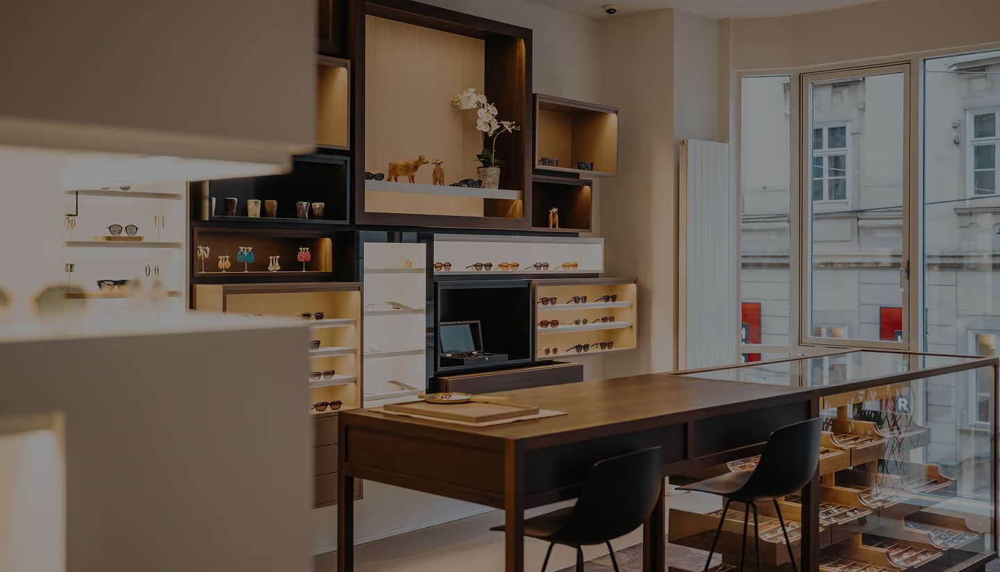
Hartmann Wien is a luxury eyewear house, situated in the very center of Vienna, with a stunning view of the St Stephan's cathedral. For 2 generations now, the brand has been the the center of attention for the discerned local audience, but also the reason for clients to fly in from other continents to visit and shop.
Their craftsmanship, services and products were world-class. Their visual identity and their web presence... not so much.
The Change of Generations
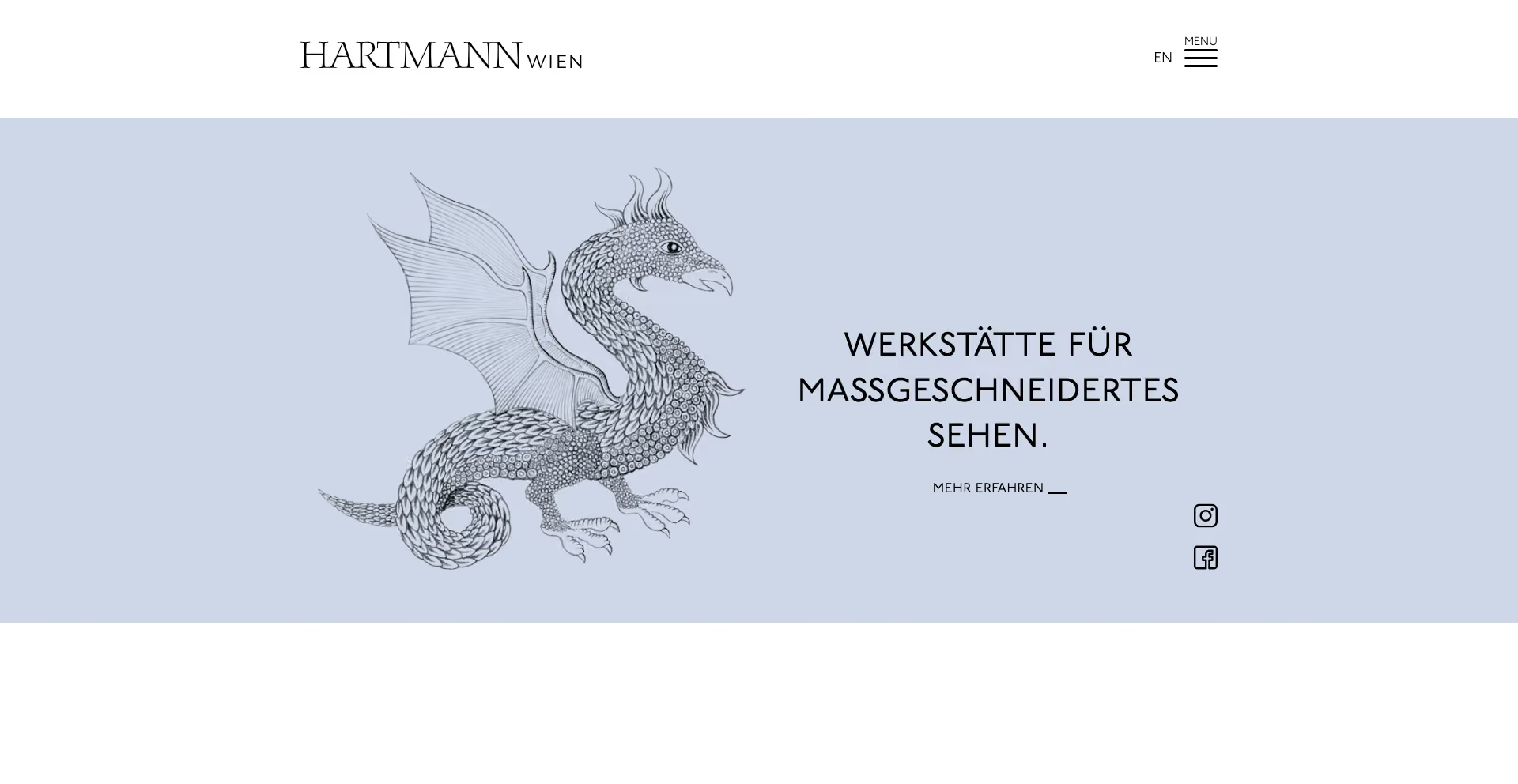
Hartmann Wien established themselves back in the '80s, but their visual identity had grown without intention. The logo was a dragon, hand-drawn years earlier by a family friend. The color was a baby-blue chosen based on personal preference. None of it was wrong per se, however it had no strategy underneath it, and it quietly undersold a genuinely luxury business to the modern, discerning clientele they wanted to reach next.
With the founder Erich Hartmann moving into retirement, and his daughter Veronika taking over the business, the time has come for change.
Strategy-First
With a serious brand like this, you don't play guessing games. With the Discovery Workshop scheduled in my calendar, my intention was to get to know the brand inside and out, define their positioning, differentiators, and multiple ICPs.
After the first couple of sentences exchanged with Veronika, it became crystal clear that Hartmann Wien was no ordinary shop-and-go type of business. In fact, there were five specific points that made them stand head and shoulders above the market: deep personalization, handcrafted sustainable materials, a boutique-as-living-room experience, advanced biometric vision correction, and lifelong relationship-building and aftercare. This is what made them a brand!
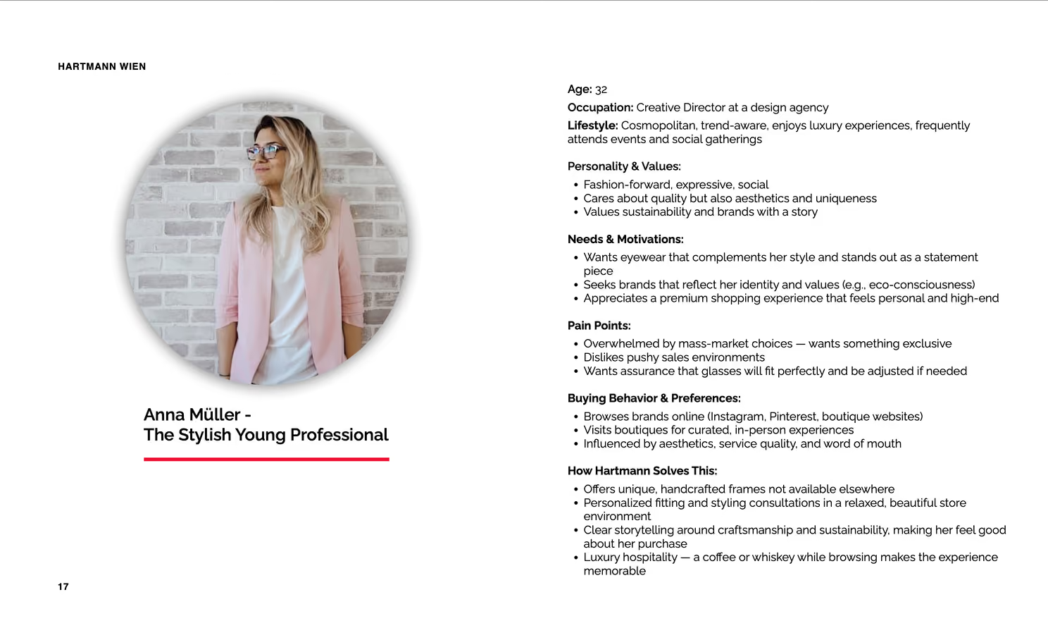
Then, we defined the audience - 2 core demographics, 4 working personas - the Stylish Young Professional, the Fashion-driven Creative, the Discerning Executive and the Elegant Retiree - each with real motivations and pain points, so every later decision had someone specific to answer to.
Visual Identity
When working with well established brand like Hartmann Wien, you have to be careful not to change them to the point where they will be unrecognizable to the already established audience they want to keep. It took 40 years to get this far, after all. At the same time, the key issues need to be solved in order to remain relevant, but to also attract the new generation of customers who are yet to become the brand ambassadors.
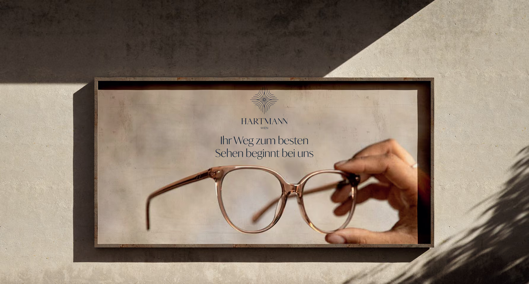
When choosing who to trust with this task, one name came to mind before everybody else: Antonia Hammermann. And as usual - she delivered. The dragon was replaced with, at first sight, an abstract symbol, in order to avoid the industry's cliche of using either and eye, or a eyeglass frame for the logo. However, it was not void of meaning - it represents an iris surrounded by 4 fingerprints to symbolize the 4 members of the Hartmann familiy.
Typographic alignment, one of the biggest issues of the old logo was also fixed.
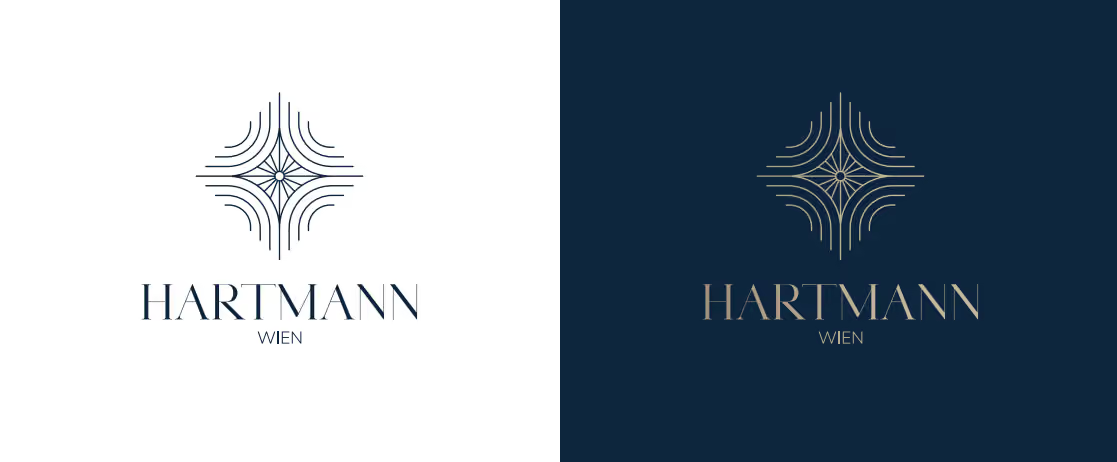
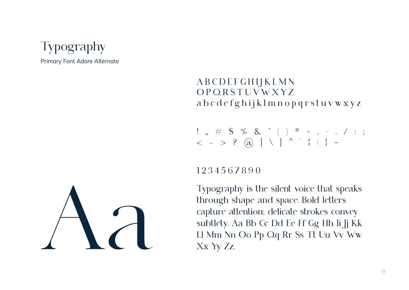
Typography was only slightly altered in order to keep the brand's recognizability - Adore Alternate, Ivy Mode and Mulish Light proved to be the perfect combo for Hartmann Wien's unique identity.
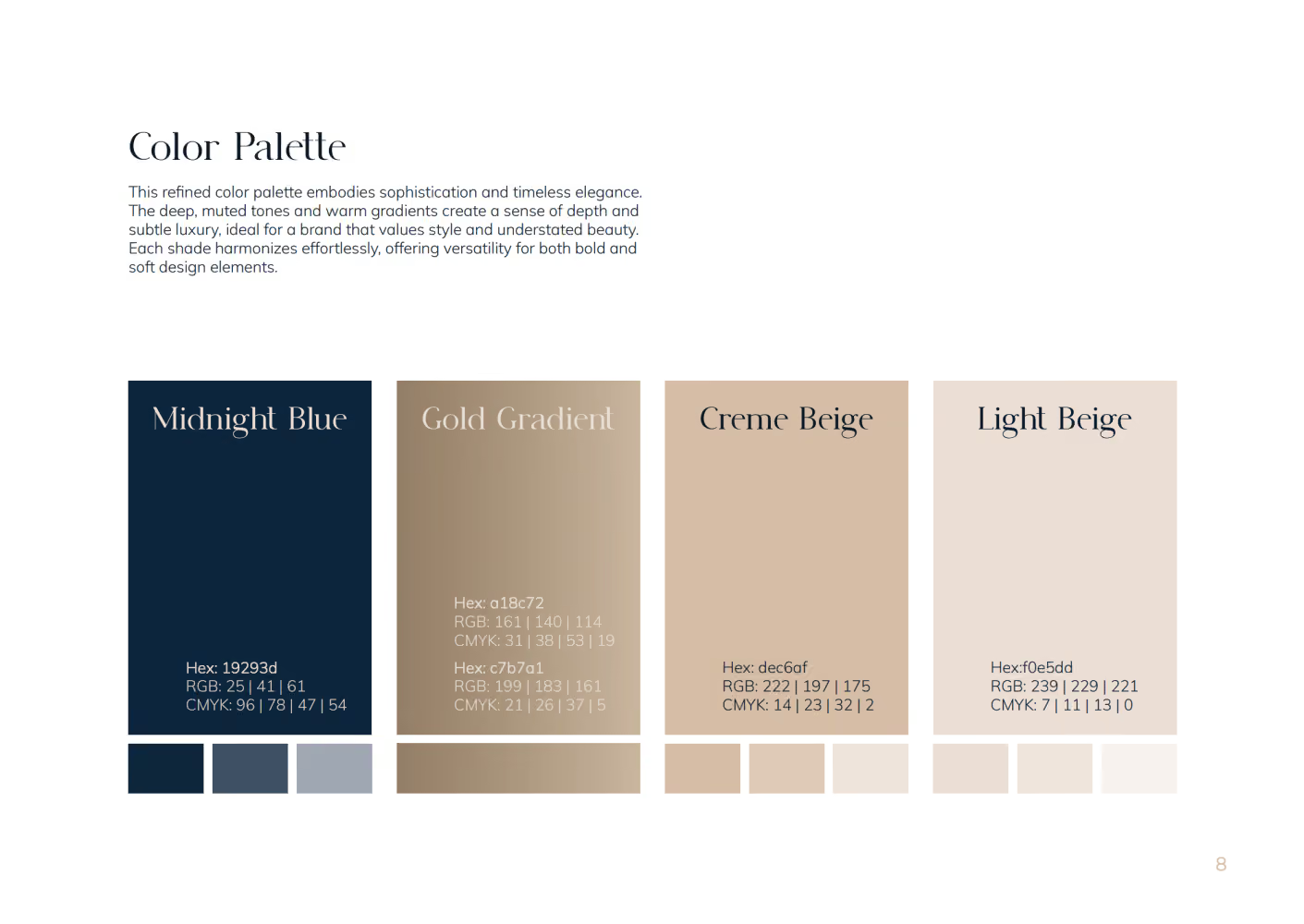
The biggest, and perhaps the most important change was the color palette - away with baby blue and in with the colors of depth, versatility and silent luxury, all while matching the wood, leather, and brass of the actual store, not a trend.
The whole system was documented in a brandbook so the identity could outlive the project and stay consistent across packaging, print, signage, and web.
Going Online
The website had a specific job: make a visitor feel what walking into the shop feels like — the "wow," but calm, unhurried, exclusive. So the build deliberately avoided the usual section-stack "bricklaying" in favour of a site that reads as one cohesive flow, the way the store itself does. I have to give credit where credit is due, I could not have done this without the experience and the attention to details that Olja Vučićević brings to every project!
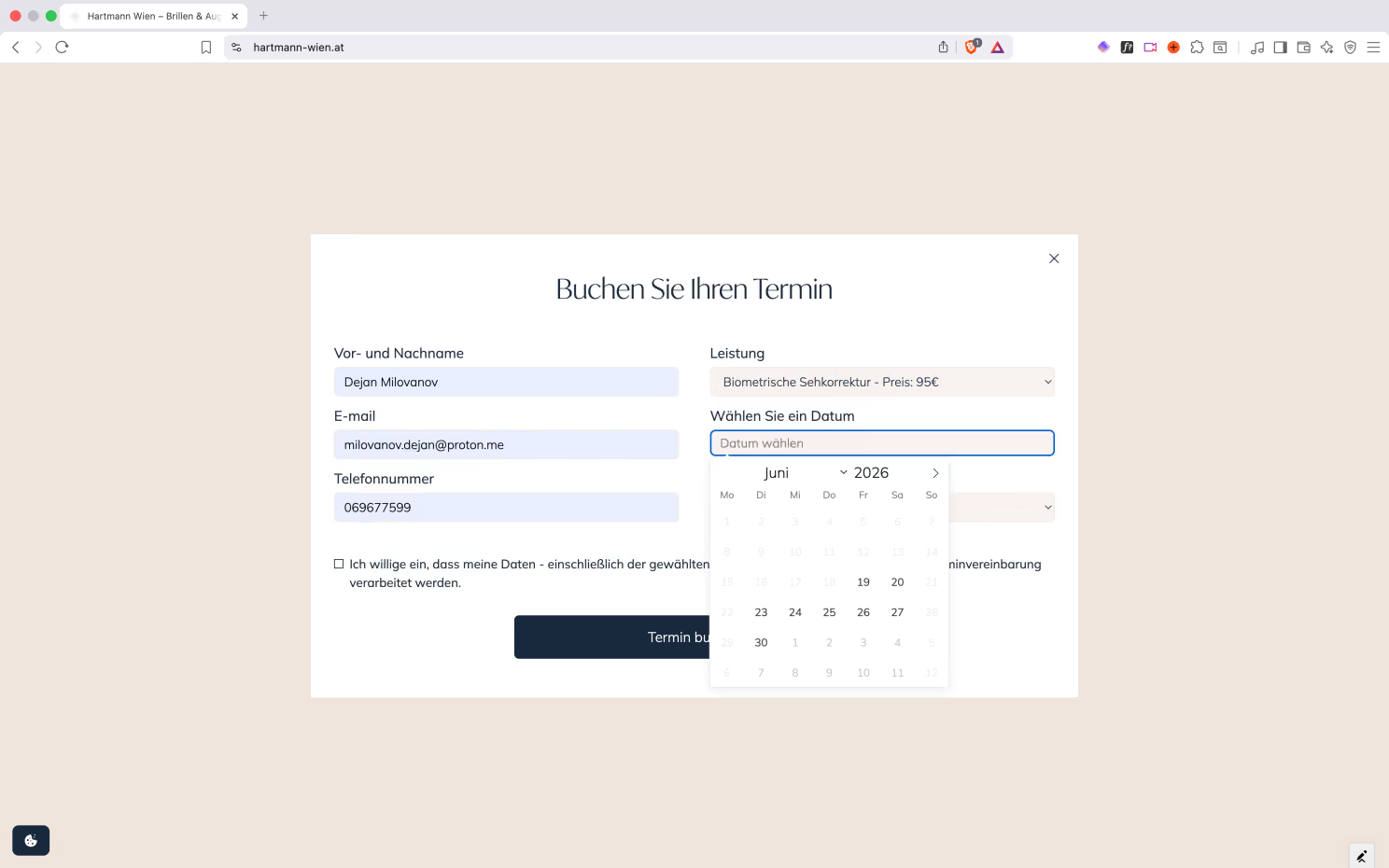
The booking system lets clients schedule the right kind of appointment - biometric vision correction, OCT, contact lenses, frame-and-lens consultation, aftercare - with the service and price made explicit, and GDPR-conscious handling of health-related data built in.
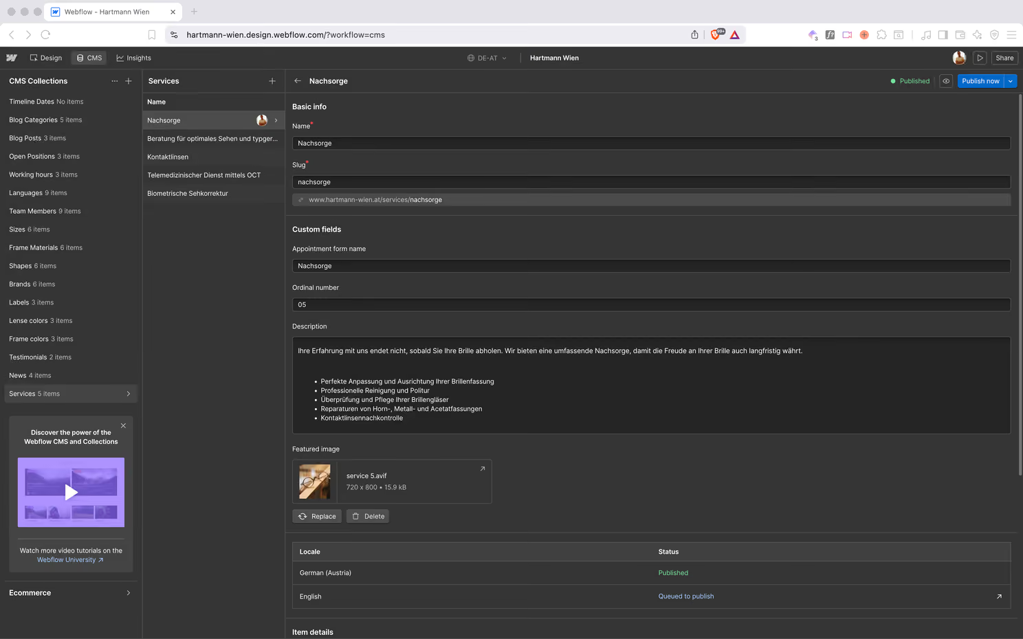
It's built on Webflow, so the team can run and grow it without being trapped in a developer queue. It is the same principle I bring to every site: the brand should own its own presence.
The Takeaway
A website is the last thing you build, not the first. Hartmann Wien had everything that matters - heritage, craft, supreme service and products coupled with a genuinely special experience, but wrapped in a brand that didn't say any of it. The goal of the project wasn't decoration. It was deciding what the brand stands for, building the identity to carry it, and shipping a site that finally matches the room you walk into.
Positioning -> identity -> web. That's how a website becomes an asset that proudly serves the brand mission, instead of a brochure.
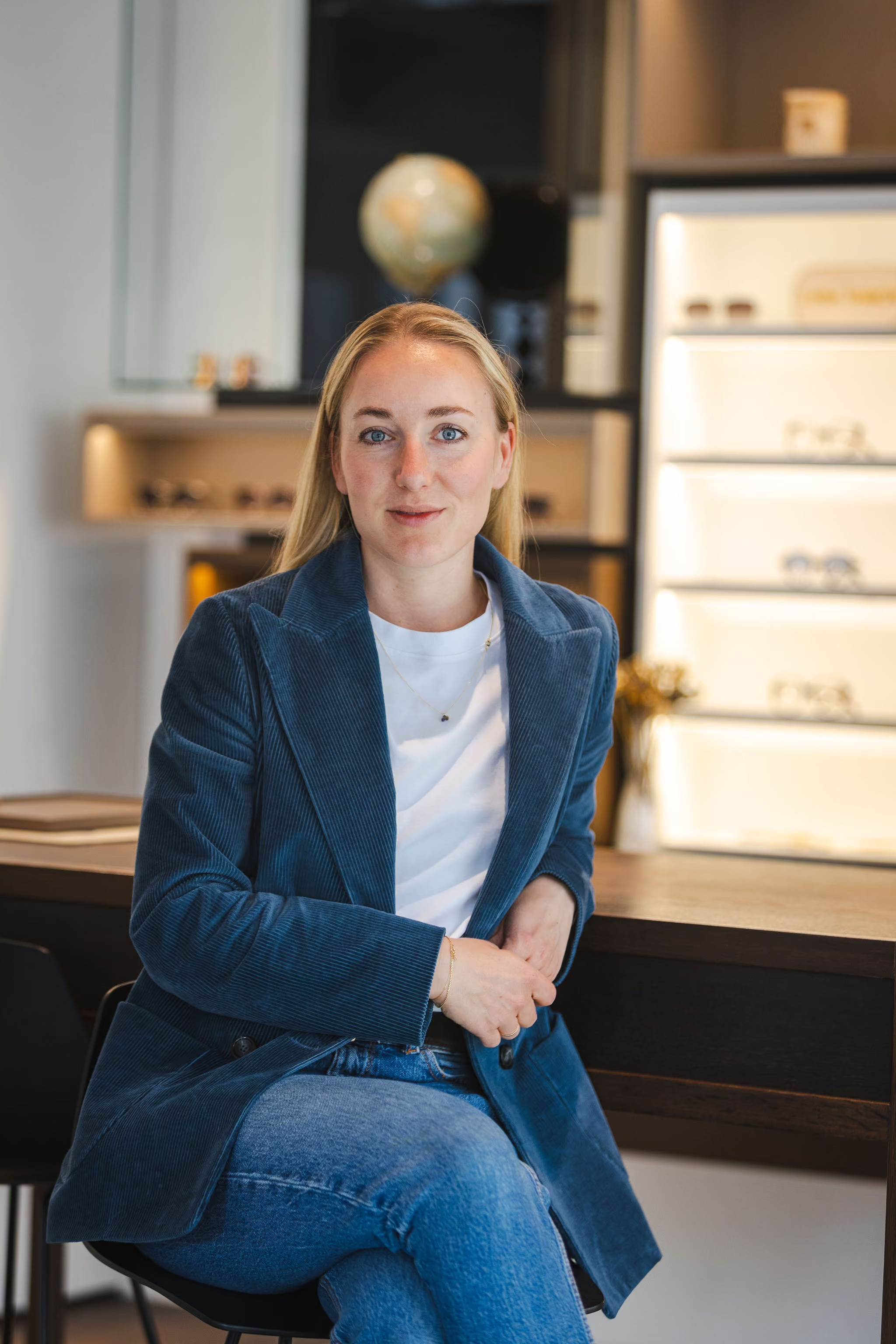
Veronika Hartmann
Owner
,
Hartmann Wien
The support was absolutely fantastic. Professional and personal. I couldn't have wished for a better result. Dejan got to know us, analyzed our needs, and created the perfect brand and the perfect website for us. Thank you!
Veronika Hartmann
Owner
,
Hartmann Wien